How to set all the elements together
Updated: Apr 7, 2021
Colors are an integral part of the understanding of the world as a whole since they serve to be as means of various associative emotions and communications. Hence, various fields have focused a lot on the use of colors and they can serve towards having a therapeutic impact. Some of these disciplines include psychology, neurobiology as well as architecture. For centuries, importance has been placed on the use of various colors in order to create the desired impact regarding the architectural space in question. Here I will talk about the colors I used to decor my home and the desired impact they are used to create.
I have mixed yellow, grey and white colors in the decoration of my home.
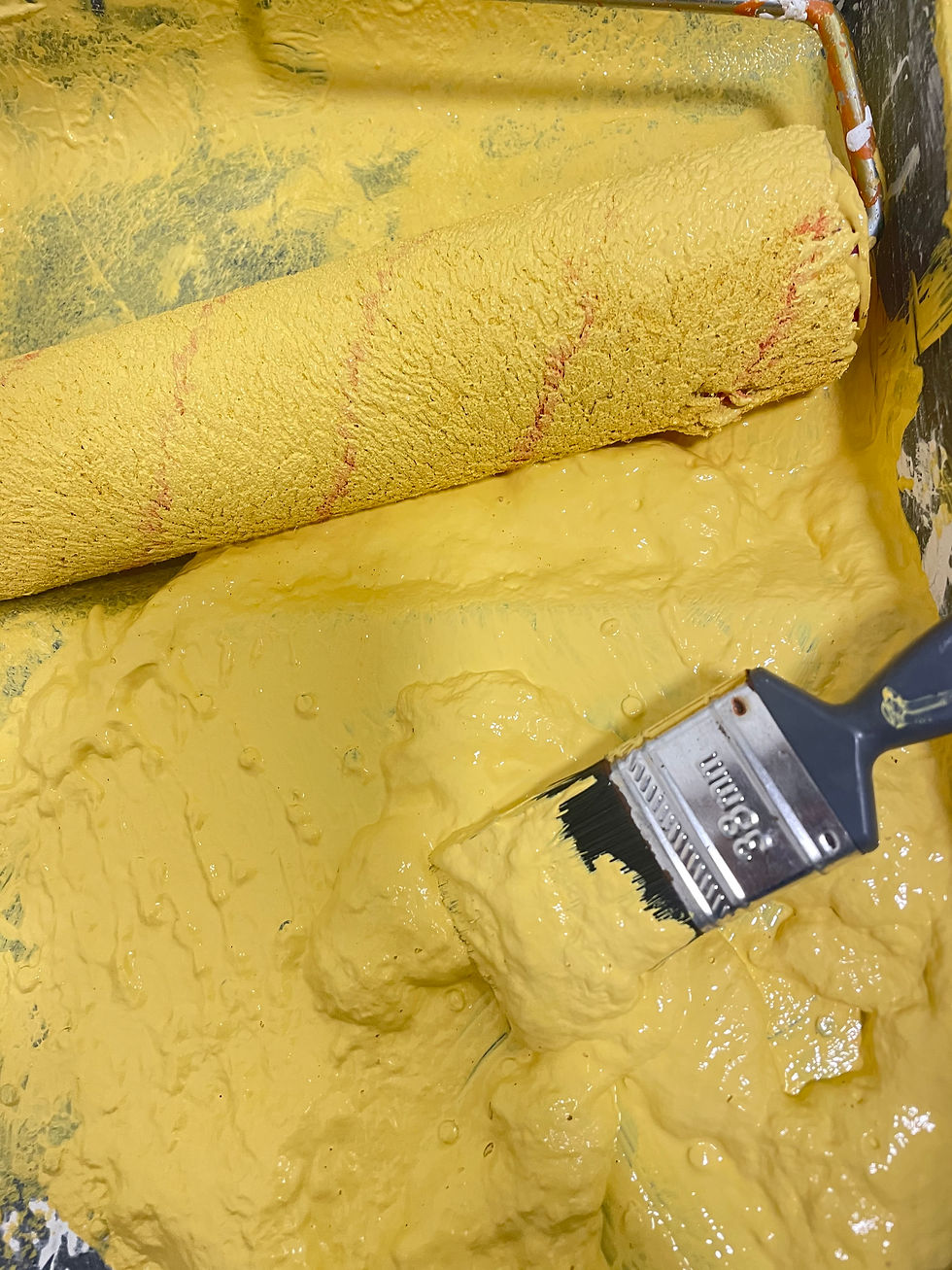
Yellow:
Yellow color is used in the status quo in various architectural spaces. Therefore, let us understand the various aspects of the color 'yellow' and why is used in architectural spaces. The effect that yellow is intended on achieving is that of cheerfulness, joy, optimism, and Joviality. It is associate with a plethora of positive emotions like that of cheerfulness vitality and radiantness. A shade of yellow, mostly a lemon-ish yellow is used in ceilings to make the height of the ceilings look taller than the ceiling actually is. Similarly, it can also be used on the floors, keeping into consideration the color of the ceiling and walls, diverting and incepting a sense of elevation within individuals. Yellow color is used inside and sometimes on the façade of the architecture in order to increase the reflection of the daylight and playing with the natural light. Yellow color in the exterior or façade of the architectural building serves to have a rather welcoming and inviting purpose as well.

White:
The rise of the minimalist architecture also led towards an increasing use of white,in the exterior as well as the interior of the designs. White color, used in the exterior of the buildings is aimed at depicting the purity and the nakedness of the design. Since the absence of any distraction caused by other colors or patterns, the design of the building is much clearer and seems purer. White is also used in the interior to depict cleanliness along with an inclination towards scientific innovation and an environment stimulating studying. Apart from its impacts on the emotional perception of individuals, white is also used in the interior to create an illusion and distort the perception of space for individuals, making the space look rather bigger and spacious.

Grey:
Grey is also a color that is commonly used in interior designs of various architectural spaces. Grey is considered as being the most suitable neutral color to be placed on the background since such a neutral color tends to give depth to the space,when used in a monochromatic style. There are some shades of grey, which are used to invoke feelings of warmth and organic nature of things, rather than merely being dull and boring. Grey color is considered as versatile, by conforming to different feelings that the architect wants to give from the certain architectural space. This can be achieved by contrasting grey with different other colors.


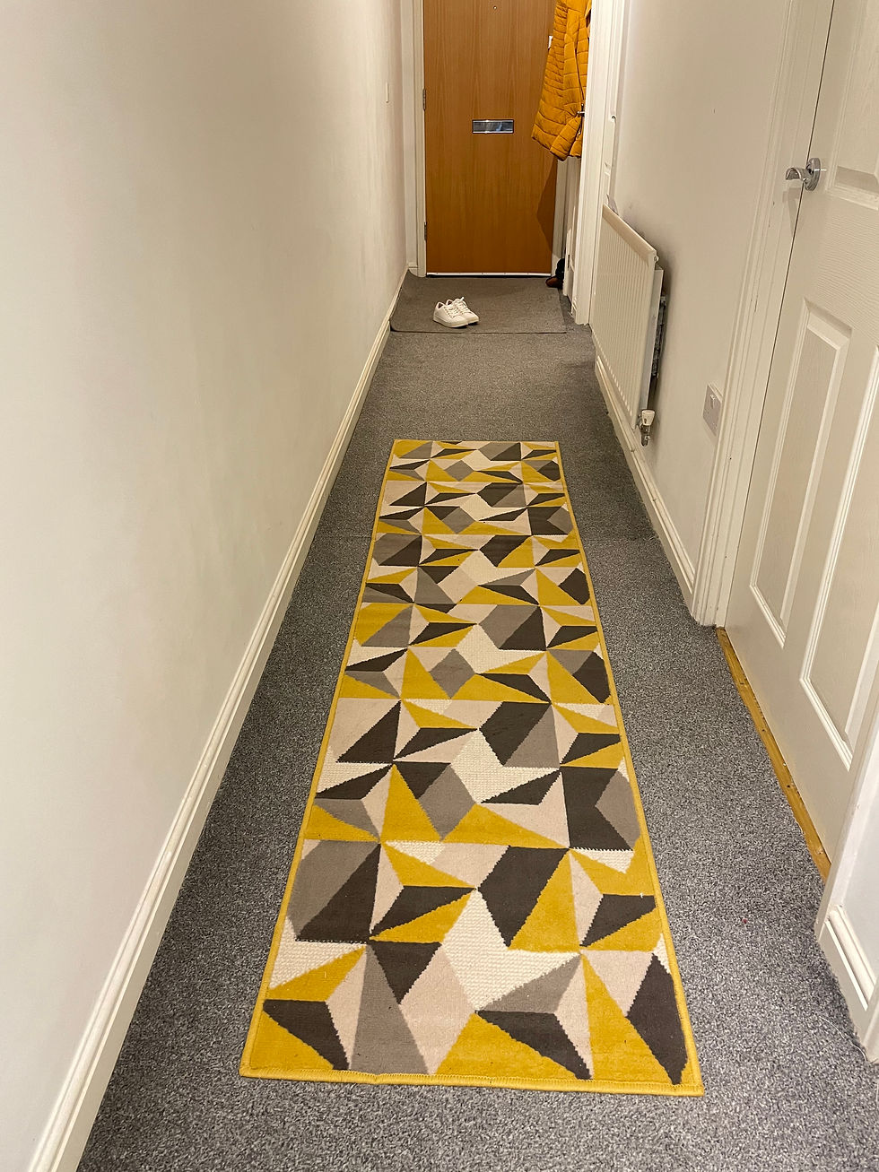
The floor of my entire home is grey, I have put a geometric narrow runner in the hallway, it has the same color trend, the bathroom mat is also following the same theme, and I have set the toilet with matching hand towels and yellow soaps, matching toilet accessories, and painted front wall with yellow paint. The living room area also fit together. My bedroom and study room has common theme of white and grey colors. All the elements like, color, texture shape and form in my home belongs to another, according to hatch interior design https://www.hatchdesign.ca/principles this is one of the vital principles of interior design.


B&Q hand towels, toilet mat tooth brush holder and lotion dispenser.


Comments